First we thought the PC was a calculator. Then we found out how to turn numbers into letters with ASCII — and we thought it was a typewriter. Then we discovered graphics, and we thought it was a television. With the World Wide Web, we’ve realized it’s a brochure.– Douglas Adams1

I recently started a new venture. What I am going to do with it, I do not know yet.
While setting up the “Under Construction” page I realised that centering the caption below an image is not as simple as centering the image, then centering the div.
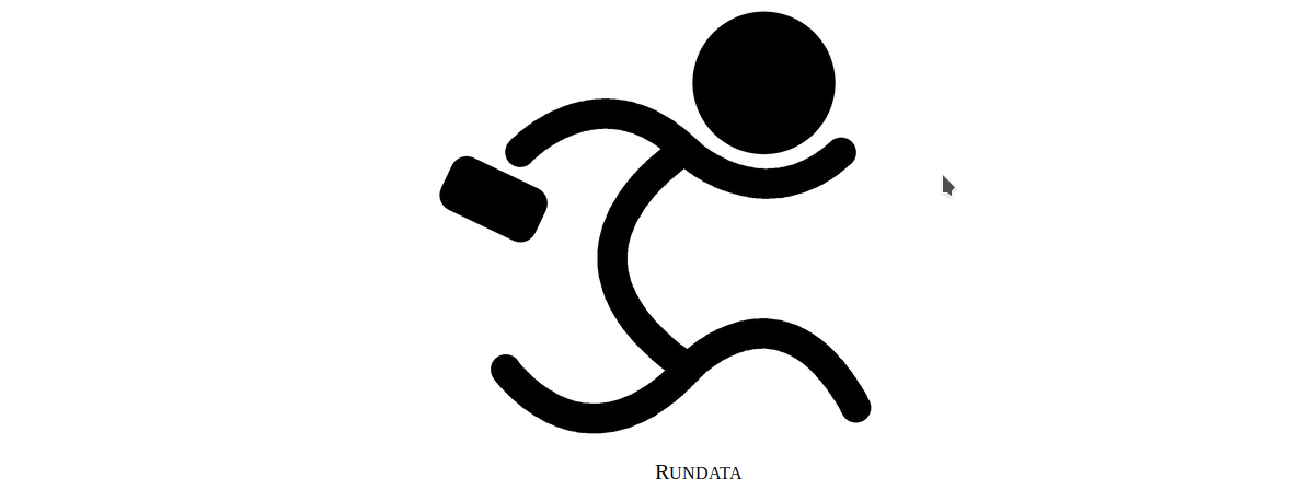
Look at the following image, where both image and text are centered on the page:

Does the caption text RUNDATA appear centered below the image? As far as the CSS goes, both those elements are centered. As far as the human eye goes, they are not.
We don’t perceive the caption to be centered, even though it is. For completeness, here is the CSS and HTML used to produce the two elements:
<html>
   <head>
      <style>
      .hcenter {
         margin-left: auto;
         margin-right: auto;
         display: block;
         text-justify: center;
         text-align: center;
         font-family: Bookman;
         font-size: 20px;
         font-variant: petite-caps;
      }
      .hfull {
         width: 100%;
         display: flex;
         flex-direction: column;
      }
      </style>
   </head>
   <body id=bodyid>
      <div class=hfull>
         <div class=hcenter style="width: 600px">
            <img class=hcenter style="width: 400px" src=Logo-2.png>
            <p class=hcenter>Rundata</p>
         </div>
      </div>
   </body>
</html>
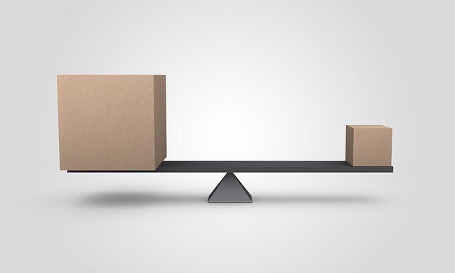
A better way for the caption to appear “centered” is to be aligned with the center of mass of the image. That however breaks down in the pathological case, as in the image below:
If we do center of mass, the caption would be completely left-aligned.
Ultimately, the best way to do it is trial and error manually, and go with what “looks right”. My resulting logo with caption looks better by nudging the padding-left of the caption slightly higher:
